Designmaskinen
Designing an Admin Area & Template Builder
Case overview
In Spring 2023, during my three-month internship at Netlife Design, I contributed to the development of Designmaskinen, a specialized design tool for creating print and digital designs. Unlike other design tools like Canva, Designmaskinen is unique in its constraints, allowing users to edit specific elements like text and color within certain parameters, such as only using brand colors. This approach ensures consistent design, a major selling point for the tool.
Project Details
Project Brief: Design an intuitive admin area for Designmaskinen.
Team Members: Randi Giovertsen, Kaja von Dombug, Michaen Hermansen and Knut Sorknes.
My Role: Research, design, prototyping, and testing.
Related Link: Netlife design - Designmaskinen
Understanding the Challenge
As Designmaskinen's user base grew, the earlier system of developers manually coding
templates and handling CMS tasks became unsustainable. The solution? An admin area
empowering customers to build templates and independently manage their brand assets.
Exploring Designmaskinen
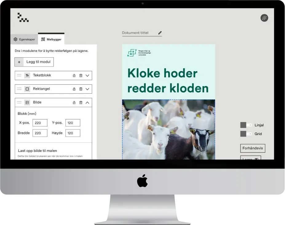
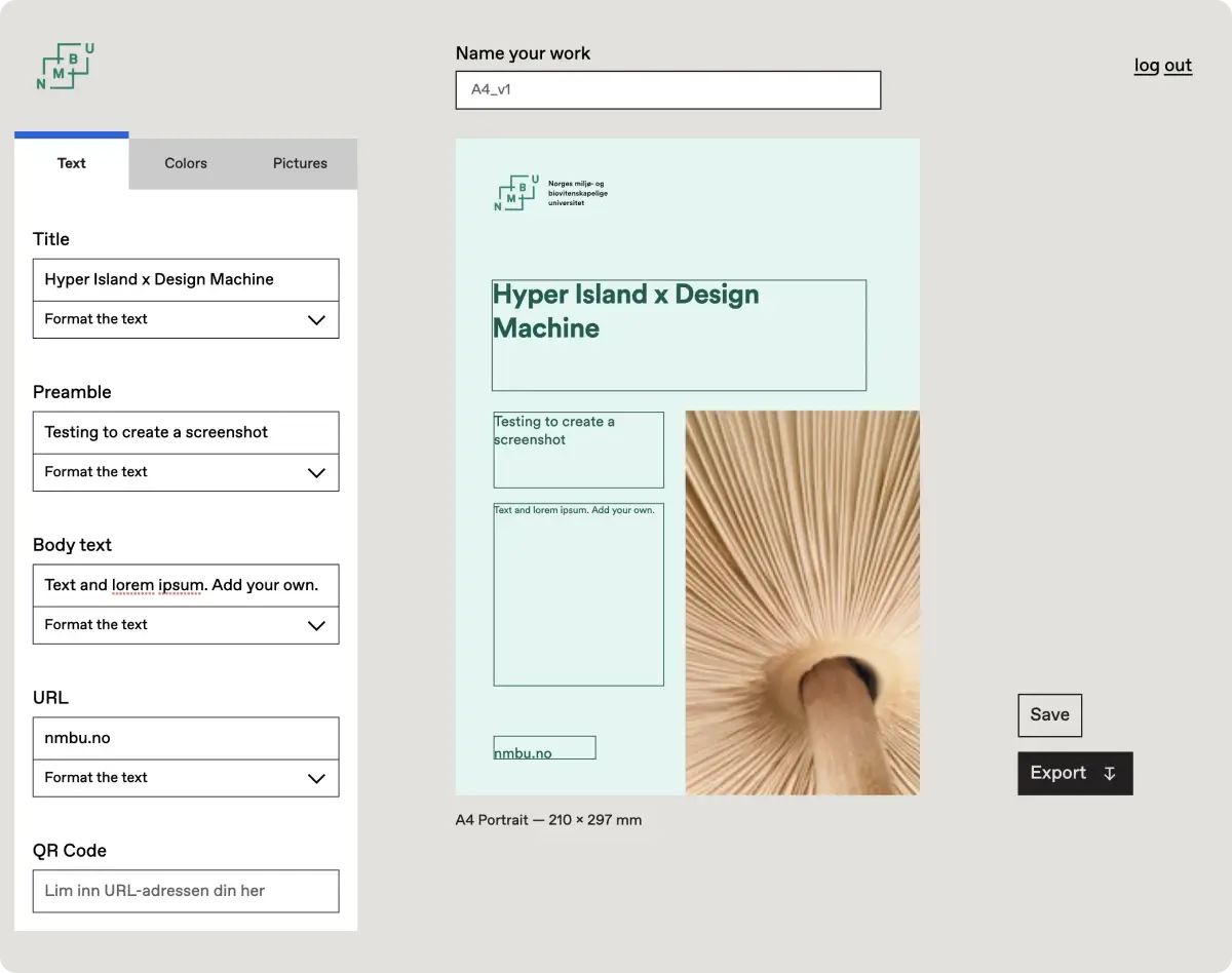
Features Snapshot
Current version of Designmaskinen. Here the users can edit the text, pictures and change between different color themes on this template. The end result will automatically follow the brand guidelines.
Mapping the Customer Journey
Focus on Admin User Experience
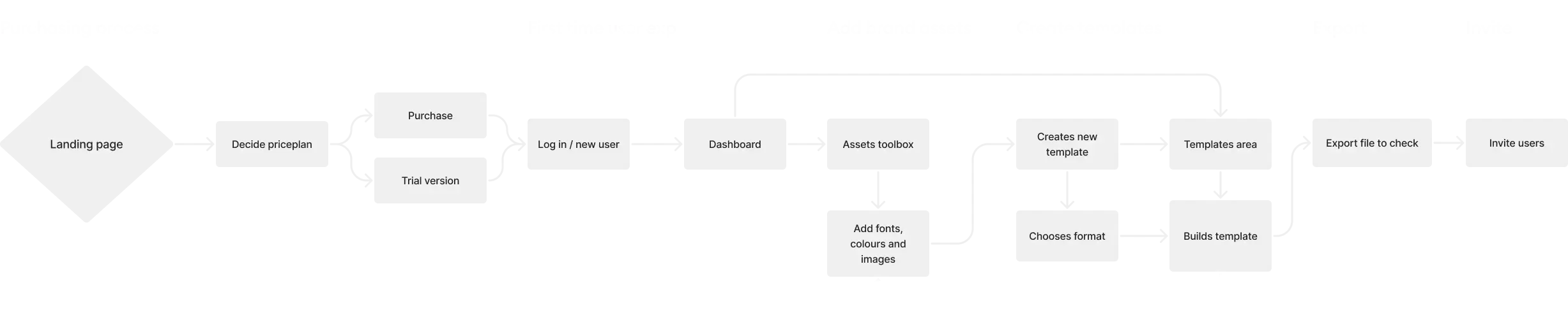
To create a best possible experience, I decided to visualize the ideal pathway for an admin
user, from purchasing Designmaskinen to setting it up for end-users. I explored multiple
potential customer journeys, ensuring each design decision would be backed by a solid
understanding of the user's flow, needs, and expectations.
Streamlining the Architecture
Embracing Simplicity
We initially had a bigger sitemap, but as one of the core values of the designmachine was
simplicity, with the slogan "we want to be a Doro phone - but for design", I streamlined the
admin area. The objective? An intuitive design with no unneded pages, ensuring ease of use.
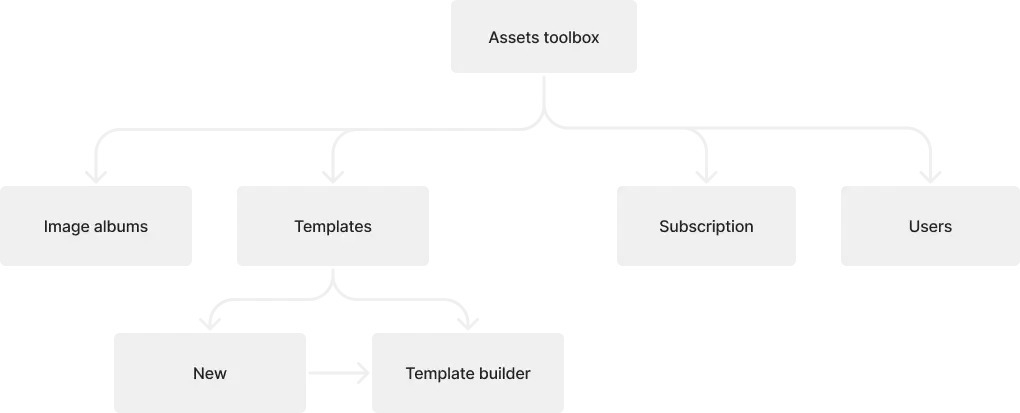
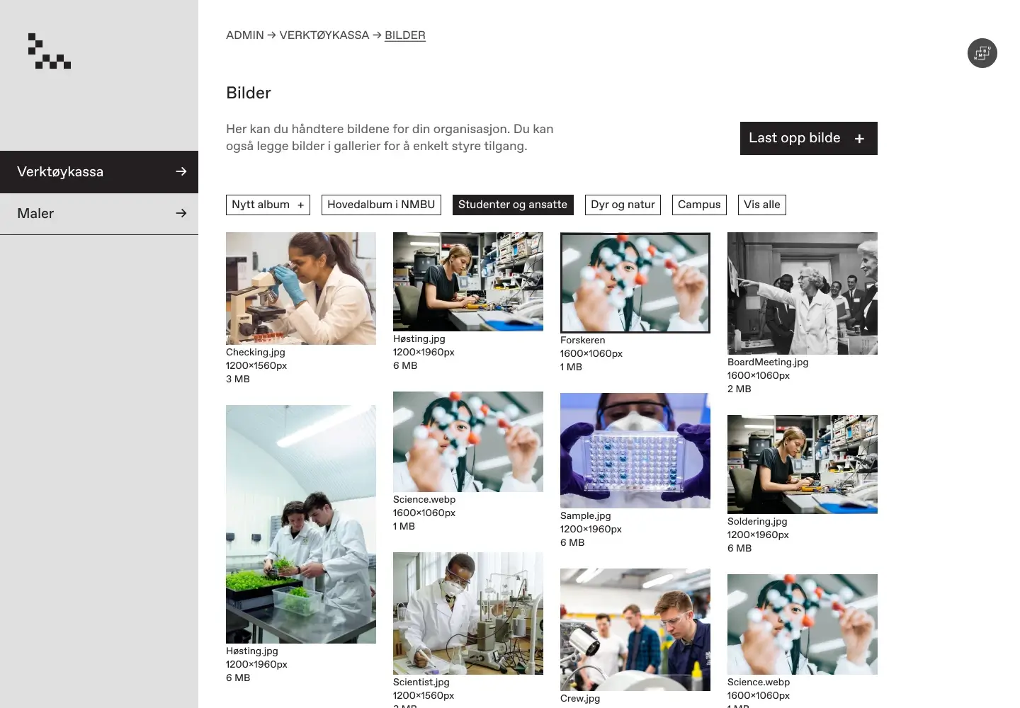
Designing the brand assets toolbox
The Core of the Admin Area:
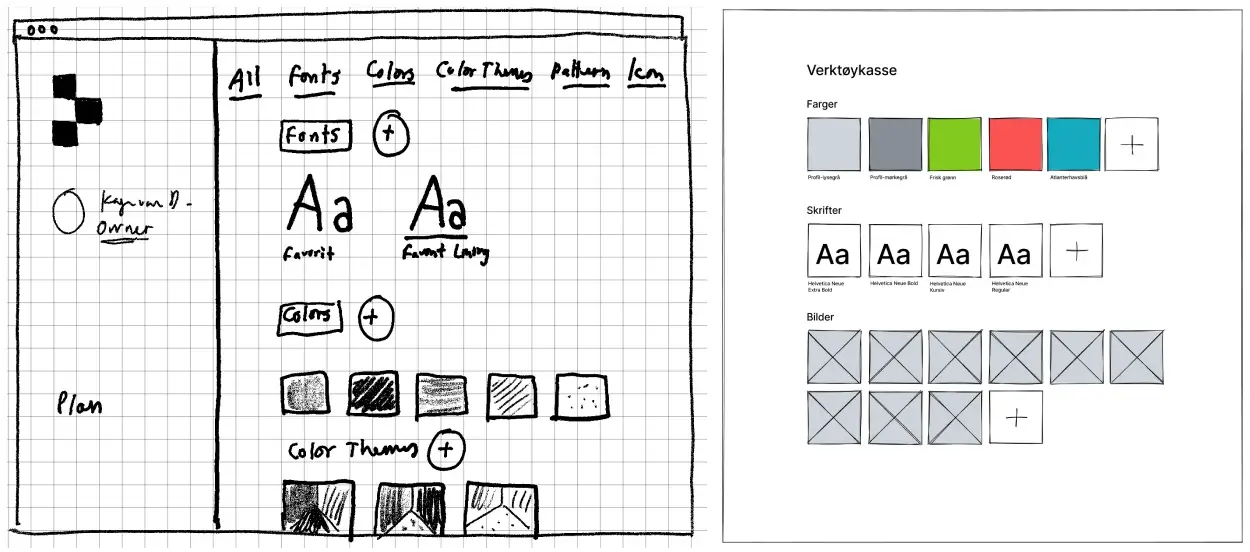
Vertøykassa (the toolbox), is the core of the admin area. Here we decided to gather all brand assets. While I had a few initial sketches to guide me, I mostly relied on my own ideas for the design details.
Design Evolution of the Toolbox
Experimentation and Refinement:
My design journey was a combination of exploration and refinement:
- Explored various left menu designs, from collapsable/docking styles to the most uncomplicated design for user-friendliness and minimised cognitive load.
- Experimented with different card designs and functionalities.
For the finalized design, I integrated:
- A streamlined menu design for intuitive navigation.
- Breadcrumbs to improve navigation further.
- Polished cards design and grid-based layout for visual consistency.
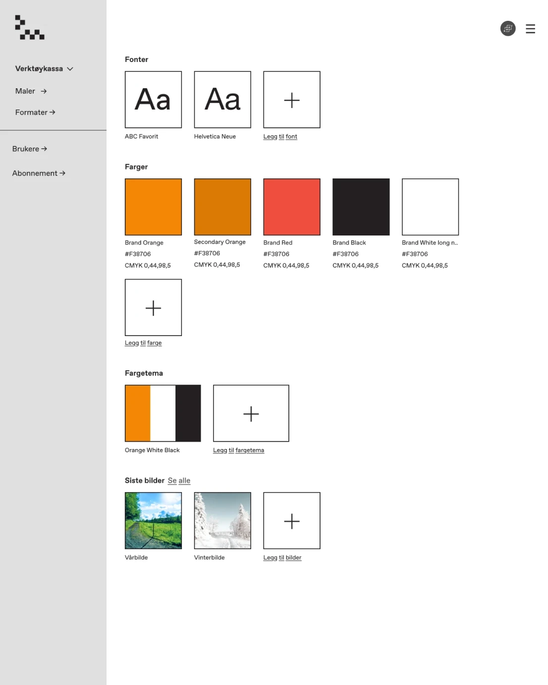
Version 1.
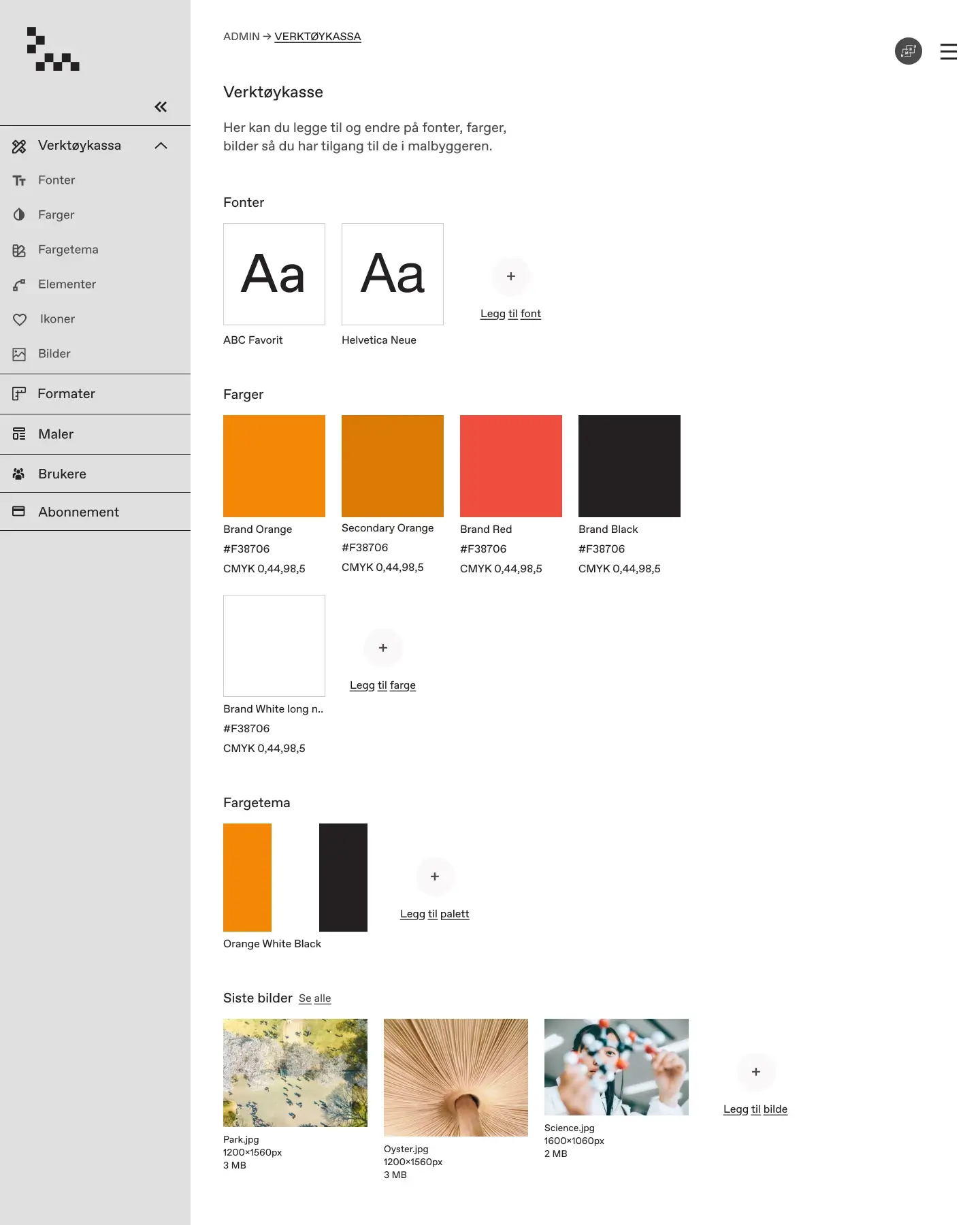
Version 2.
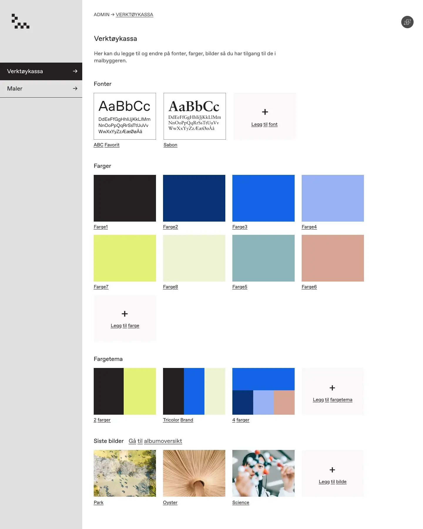
Version 3 - final
Designing the Image Album
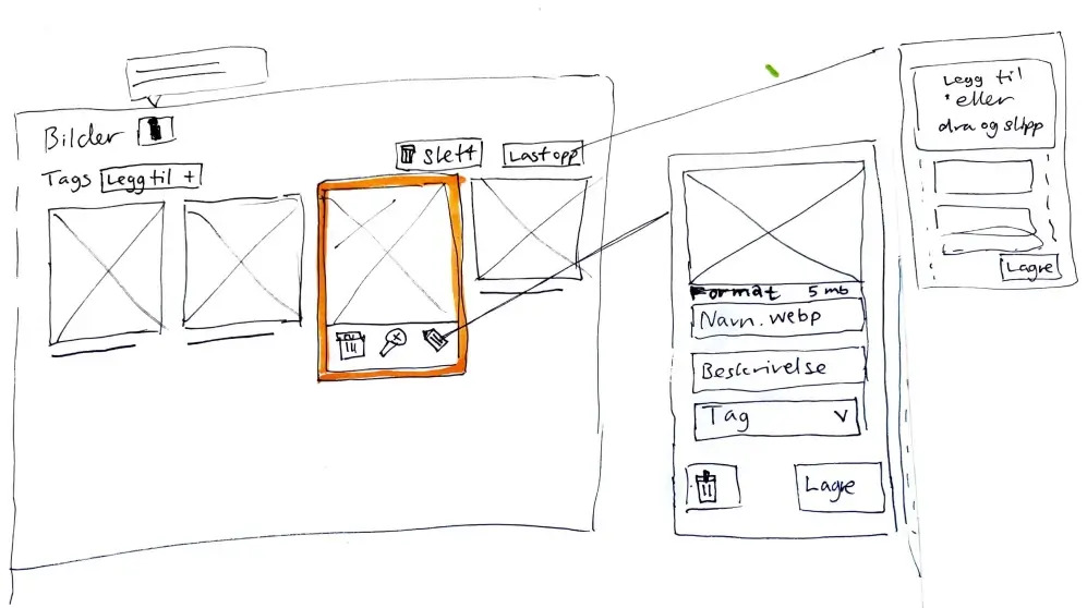
Some clients have many images so to avoid having hundreds of images in the assets toolbox, we decided to show only the latest three images, and put the rest of the images into an albums area. To figure out how this would look I first created paper sketches, then started to design and prototype in Figma. A key feature wanted was an option to categorise the images.
First Iteration of the Albums Area
I worked in iterations, prototyping and testing to getting user feedback. My goal was to "fail fast" and move on to design improved versions. This first version was functional but had several areas for improvement:
- Iconography Challenge: Image edit options (like zoom, edit name, or delete) appeared in a small menu above the selected image on click. But due to the absence of accompanying text for icons, accessibility was compromised. Developer feedback also highlighted potential navigation challenges when navigating using keyboard "tab", prompting me to rethink this approach.
- Modal Limitations: Editing was initially conceptualized in a modal
window. But modals can disrupt user flow and pose mobile adaptation challenges.
Version 1.
Version 1. Edit and change image description in input field in a modal window.
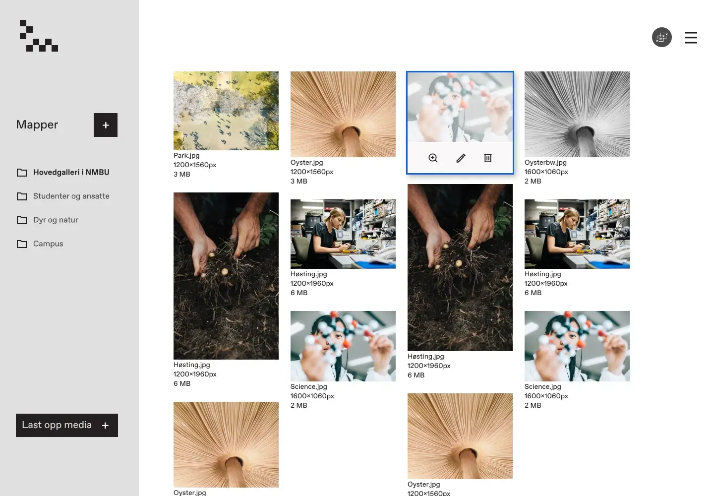
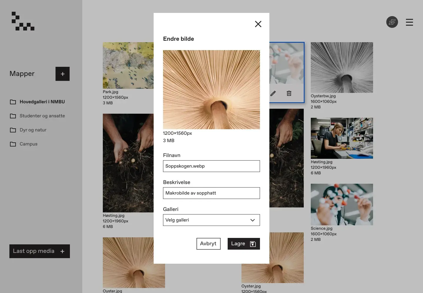
Refined Image Albums Layout
After some rounds of prototyping, testing on users, team presentations, and iterations, I had a version that both the team and I were happy with. Highlighted features include:
- Navigation Clarity: Added breadcrumbs on the top of the page, making navigating and understanding where you are easy. Also added space for a small text about the area.
- Material Design: For image categorization, I transitioned to a Material Design-inspired tagging system.
- Copy Optimization: Copy also improved based on user feedback: We changed wording from "New Gallery" to "New Album".
- Menu Transition: I proposed and implemented a slide-in menu, eliminating the earlier modal window approach. The consensus was in favor of its enhanced user experience.
- Simplicity Wins: After refactoring the sitemap, there was no point in having a hamburger menu, so I removed it.
- Keyboard Navigation: Easy to navigate using a keyboard. Simplified the
tab visual que and removed the dropshadow.
Final version of image albums.
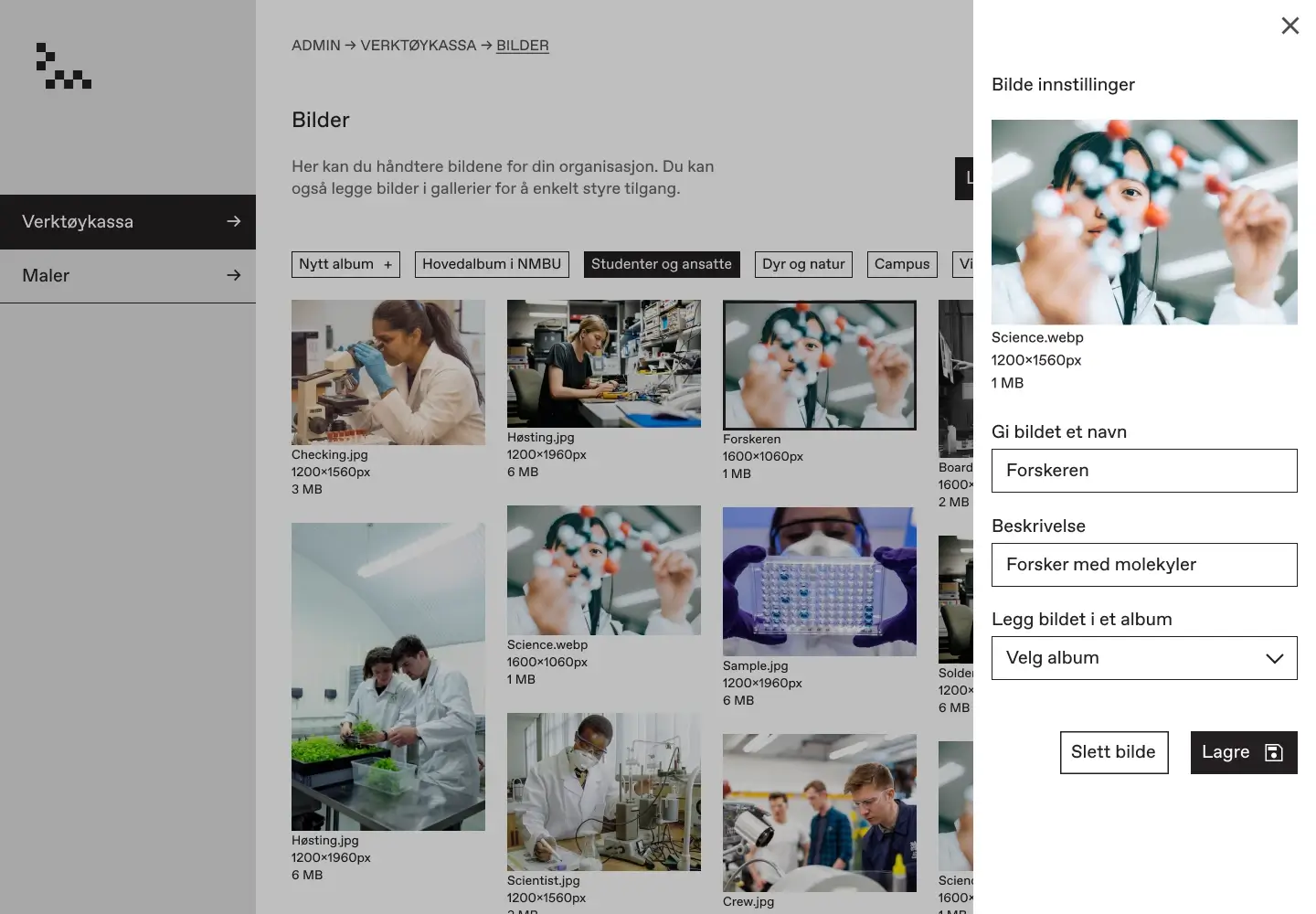
Final version with slide in edit field showing.
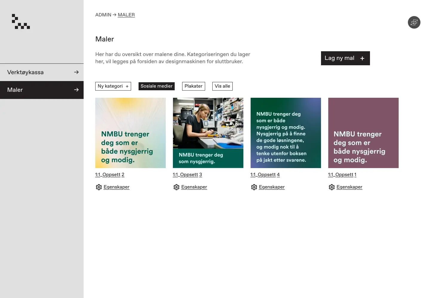
Designing the Template Management
Repurposing the Image Albums Layout
We had a lot of discussions about how this area should look. During a team meeting I proposed reusing the same layout that I developed for the image albums. This suggestion would both ensure consistency, and address other issues we discussed. This ended up being the solution we used.
Print or Post? CMYK or RGB?
One particular challenge that emerged was managing the different color profiles for print (CMYK) versus digital designs for platforms like social media (RGB). This raised interesting questions about the optimal way to present these options within the template settings and if and how color profile could be changeable after the template is created.
Template management area.
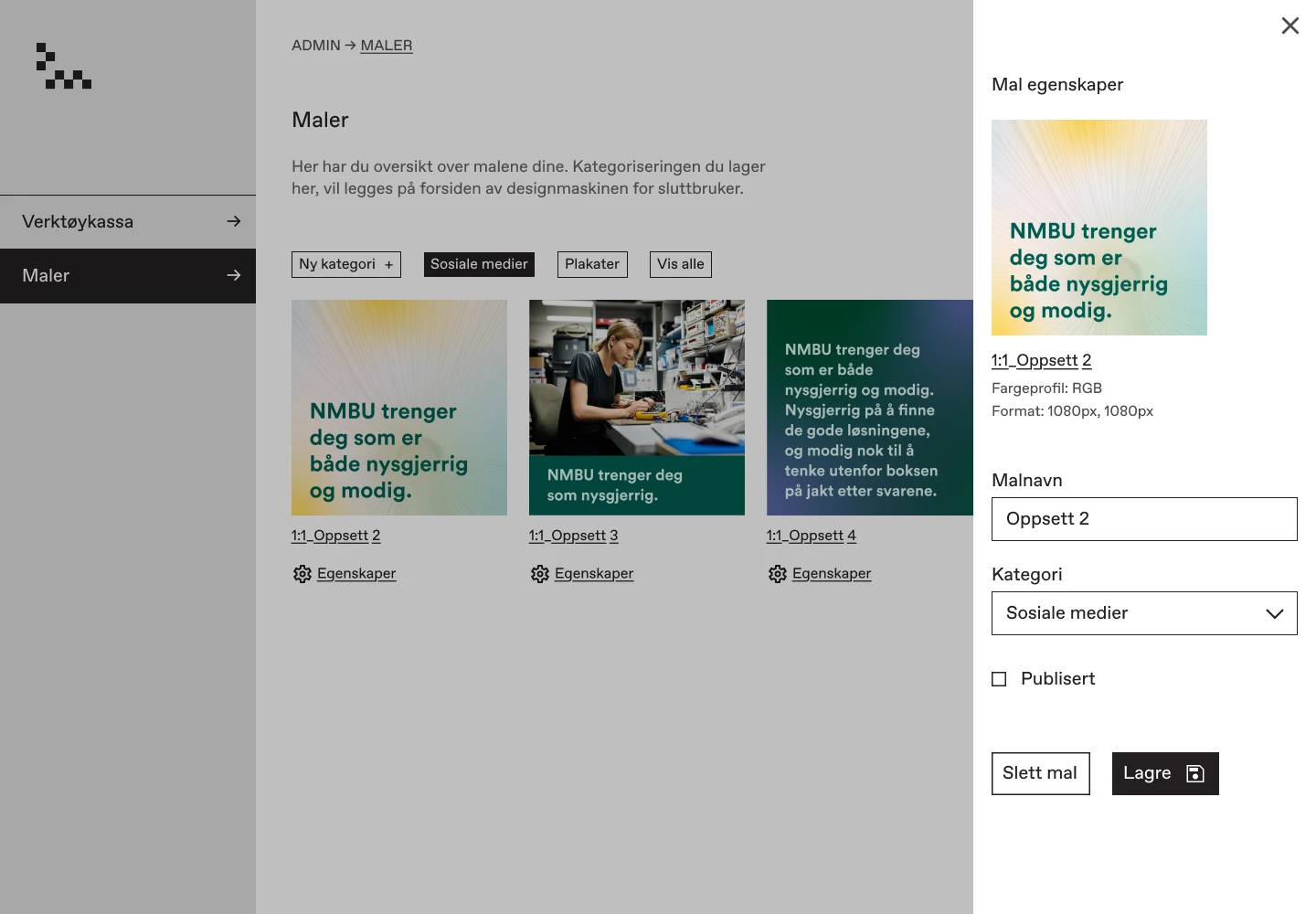
Edit options.
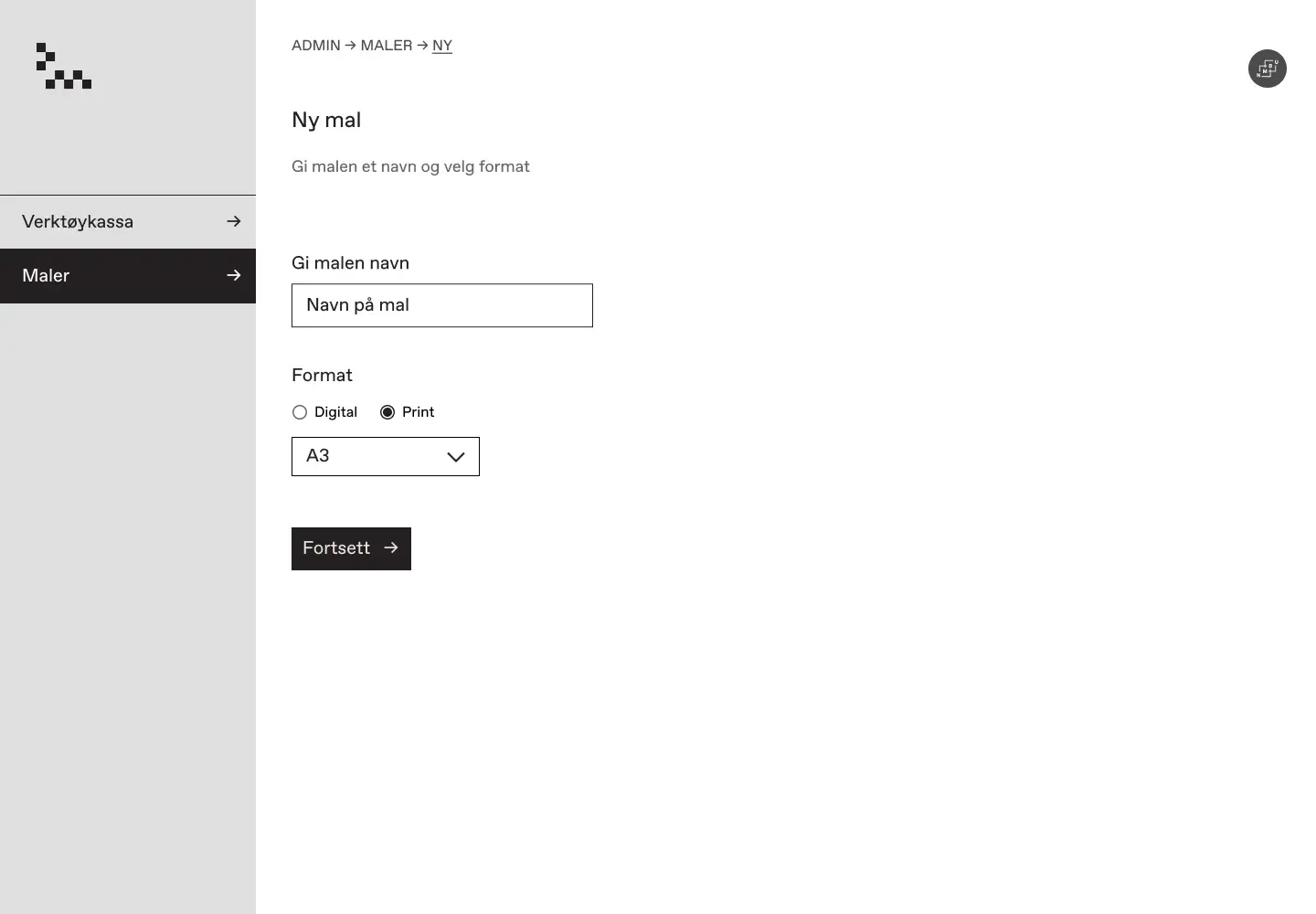
New template, choosing format changes colour profile (RGB/CMYK)
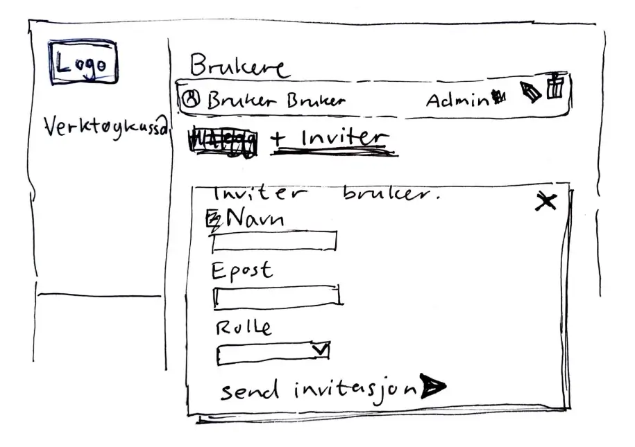
Building the User Management
When talking to users, most of them did not think they would be uploading a profile image to their user profile on a design app. so I opted for using the first letter of the user name as a placeholder - A clever trick that I believe designers for Google / Gmail came up with. This minimalist approach not only respects user preferences but also adds a touch of personalized elegance.
First sketch.
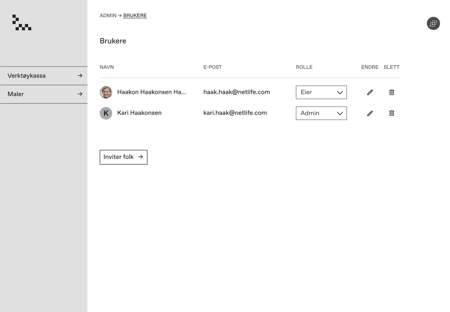
User management final.
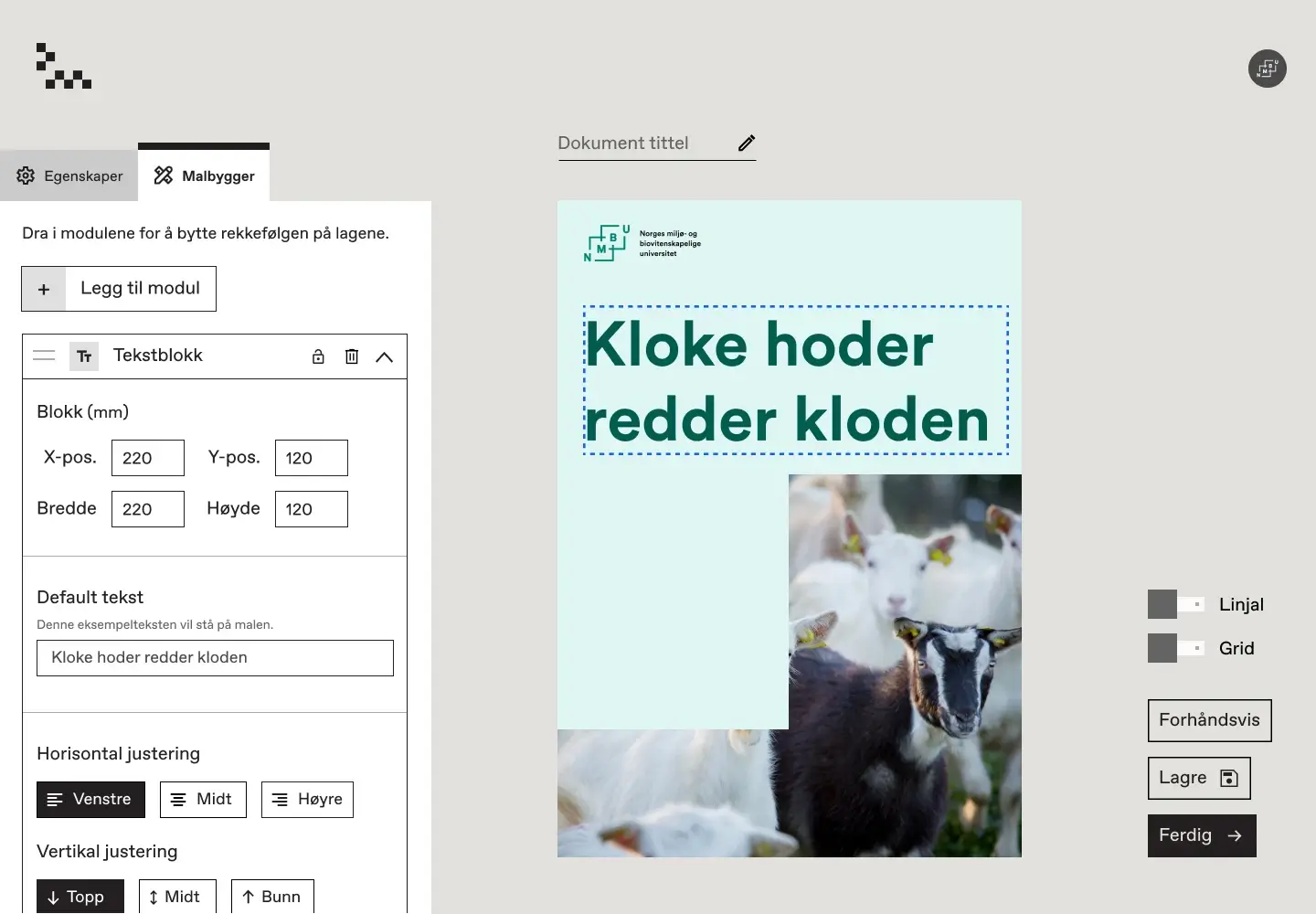
Refining the Template Builder
Diving deep into the intricacies of the template builder, I dedicated a week to overhauling its modular menu design. My focus was on streamlining the menu, categorizing options in an intuitive manner, and ensuring consistency across the layout.
Test Drive my Final Prototype.
My favourite part of any design process is watching the designs come to life in a prototype. It's this stage where the nuances surface, often spotlighting areas that can benefit from further refinement. Dive into the final prototype:
Reflections on My Internship
- Challenging my Bias: Before going into this, I had this perception of consultants as conform and perhaps a bit sharp elbowed. However, the team at Netlife completely defied this image – they were actually very down to earth! There were a lot of skilled and very collaborative people gathered in one environment and that was amazing. I learned a lot from my internship!
- Collaboration: Working in a cross-functional team with developers, having the developers in the same room as me. It made it quick to ideate and shoot ideas back and forth between designers and developers.
- Prioritizing Accessibility: I learned about designing for the highest accessibility and WCAG standards. I learned to design interfaces that can be used on screen readers and navigated with a keyboard.
- Modern Tech Stack: It was interesting to design for a cutting-edge stack featuring Next.js, Tailwind CSS, Vercel hosting, and Sanity.io for content management.
- Process Awareness Post-Hyper: I notice that I am much more process aware now than before Hyper, I am aware of where in the double diamond process we are, and allow myself more freedom and am less strict on myself in the divergent phases - this makes it easier for me to be more creative!
- Social Workplace: There were a lot of social activities to join, we went grilling and playing in the park, we went to a design award, we went swimming and doing saunas. I even joined their running team for a race - it was a lot of fun there!
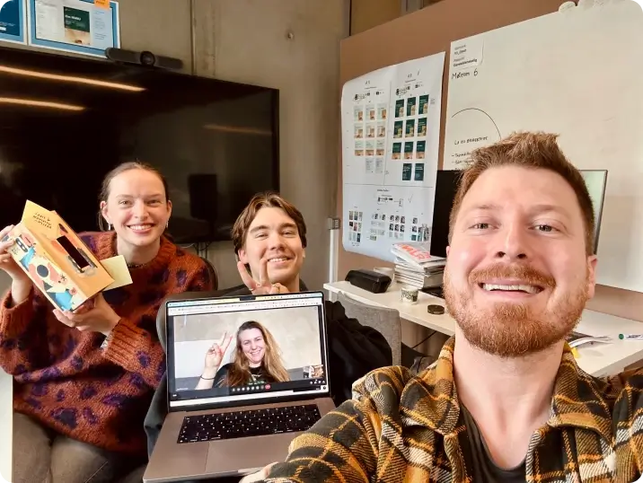
My team during a meeting.